Our website represents what we believe, what we do and why we do it
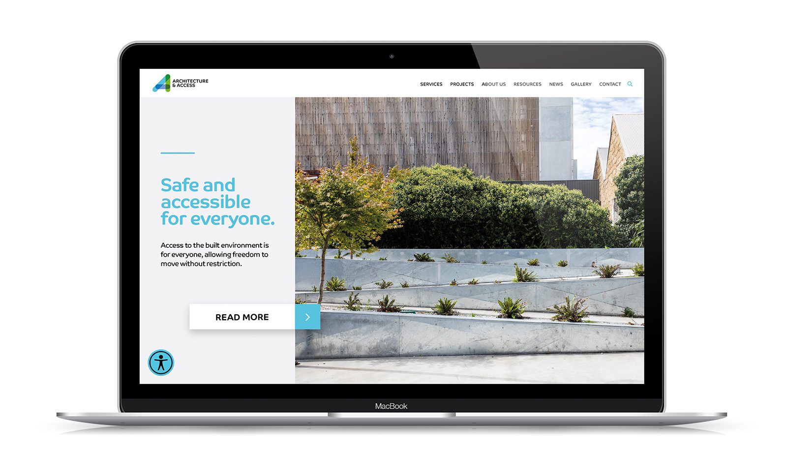
Designed by Dash Creative, our new website is comprehensive and provides thoughtful information about Architecture & Access and the services we provide.
The website is dynamic and responsive with a sleek design and compelling visual content, designed to drive visitor interaction.
Developing a new website is not as easy as it may seem. It’s akin to holding up a mirror to the organisation, you want your visitors to see what your organisation looks like.
The design process compelled us to truly define our service offering.
There is a lot of essential information about the organisation and service offering, however the navigation design enables users to find what they are looking for without excessive clicks and endless copy.
Key features of the website include:
- A balance of text and images – Throughout the website we have used Architecture & Access lifestyle imagery, images from our recent projects and text content for all the important pieces of information
- Home page design – Making clear what we do, there is a call to action. You can view our news articles; you can contact us and we believe it looks good! We also hope the home page will entice you to explore the website further!

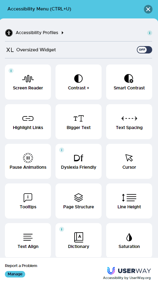
- Accessible – We have invested and installed the Userway AI widget onto the website. This feature delivers many benefits by auditing and updating the site, as well as displaying the Accessibility Menu for users to tailor their experience when using the site.
For example, select Screen Reader and it will speak aloud all page contents or select Dyslexia Friendly and the font is enhanced for readability for those with dyslexia, providing an easier and more fluid reading experience.
Our website will continue to evolve as we do, with regular updates, news articles, and service developments, a website is never finished.
We hope you enjoy the new website as much as we did building it.
